Monogram
A mark made by combining letters, often your initials.
Combine your initials and use the space around them on purpose.
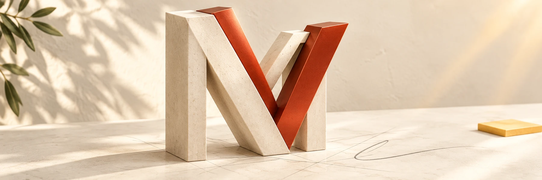
Refine the same two-initial mark begun in Create a layout and explain its solid letters, open spaces, and intended impression.
Reuse the sketches and selected mark from Create a layout. Use your first-and-last-name initials, or two initials you use to represent yourself if that pattern does not fit your name. A clear paper sketch photographed into the C27 Academy file is acceptable.
A mark made by combining letters, often your initials.
A line or part of a letter.
The open area around or inside the letter shapes.
Make a chosen idea clearer by improving its details.
For examplePlace the source image beside, not on top of, your own sketches.
For exampleA wide, rounded letter may feel calmer than a sharp, narrow one.
For exampleShrink the mark to its real use size before deciding it works.
Worked two-letter example. Start with the letters C and A. Share one vertical stroke so the C frames the A; leave enough open space to see both. At a small size, check that the A does not disappear. If it does, widen the gap, keep the earlier mark, and compare again. “Calm” is an intended impression, not a measured audience finding.