Hue
A color family, such as blue or red.
A color wheel arranges hues—color families such as red, yellow, and blue—in a circle. It helps you compare neighboring and opposite colors.
Slide 3.
 An AI-driven
Name the main color groups and explain what each color does in a design.

A color family, such as blue or red.
A color wheel arranges hues—color families such as red, yellow, and blue—in a circle. It helps you compare neighboring and opposite colors.
Slide 3.
The set of colors you choose for a design.
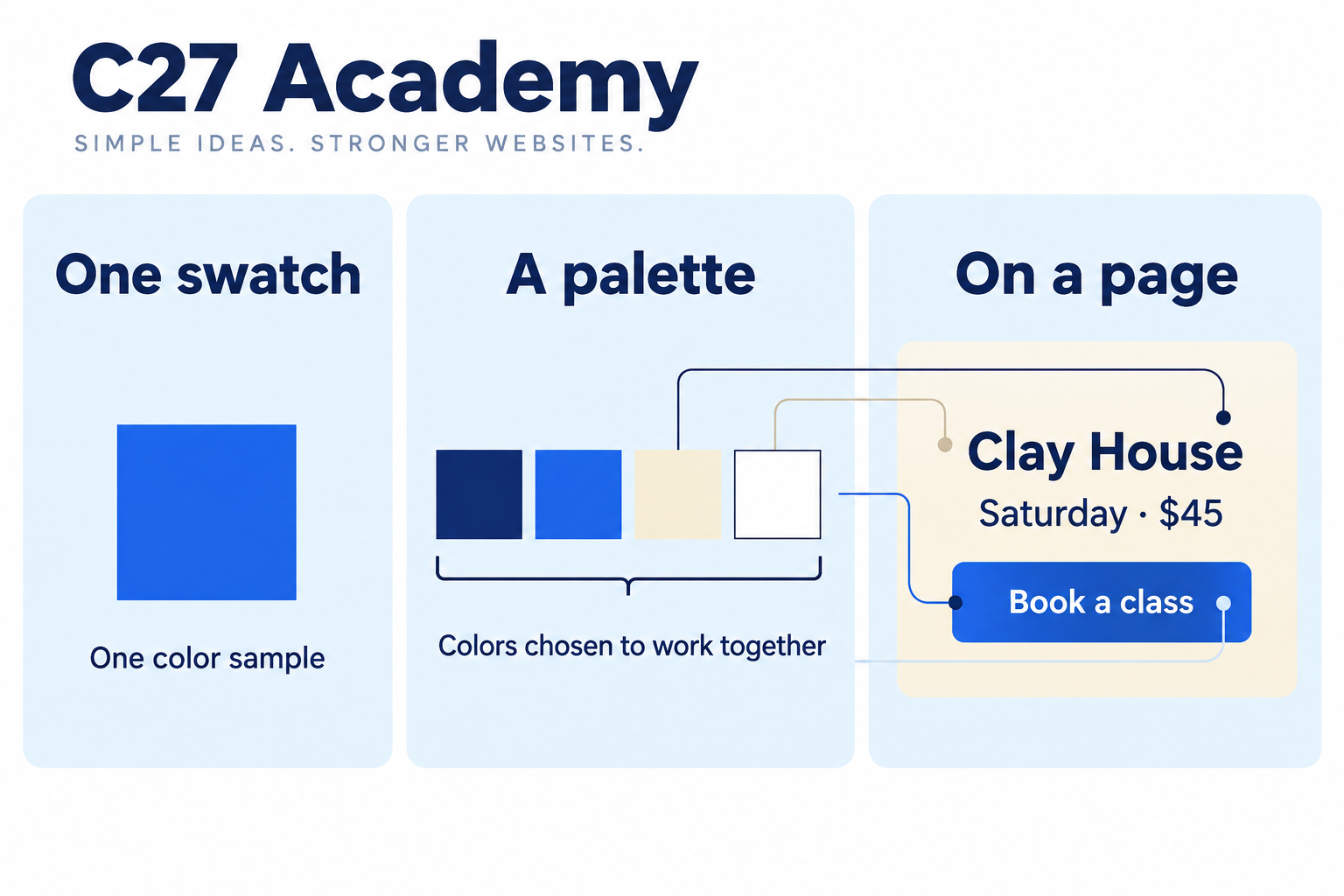
A swatch is one small sample of a color. A palette is the group of colors you choose for a design. Here navy is used for words, blue for the action, cream for the background, and white for words on the button.
The main color used to help people recognize a product or company.
A color used to help show what happened, such as an error or success. Use a clear message with it.
Use these prompts as you work through this lesson.
For exampleA cream background keeps the blue booking button easy to spot.
For exampleYou can see that the button is blue; you cannot know who prefers blue from a screenshot.
For exampleAfter applying color, check that the button label is still easy to read.