Back to courseRecognize good and bad design.
Learn to spot what makes a screen easy or hard to use.
Compare examples, then explain what you notice.
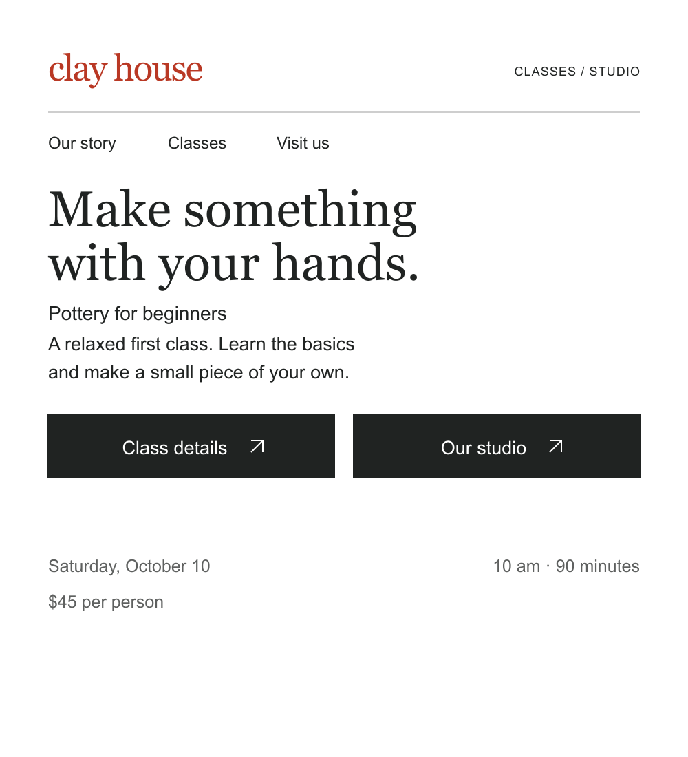
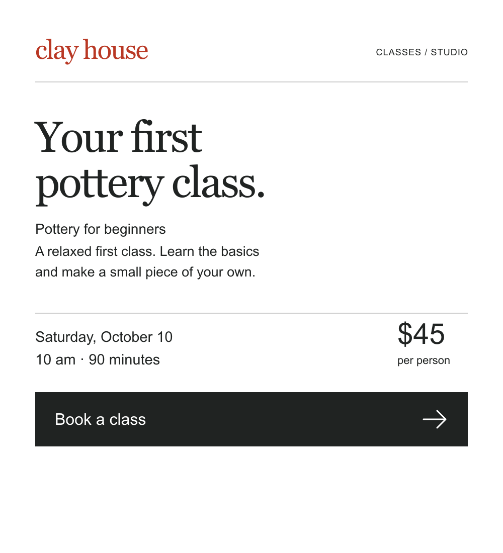
01Which page makes booking easier?
Page ALess clear
Page BClearer
02Which tells you what will happen?
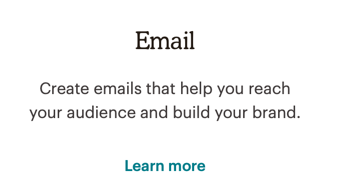
The is vague
Learn more does not name the next page. You need the to understand the .
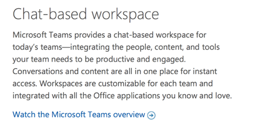
The names the next step
The tells you that you will watch an overview of Microsoft Teams. You know the action and topic before clicking.
Which page makes the easier to find?
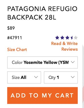
The is easy to miss
The is small. The and bright purchase button draw more attention.
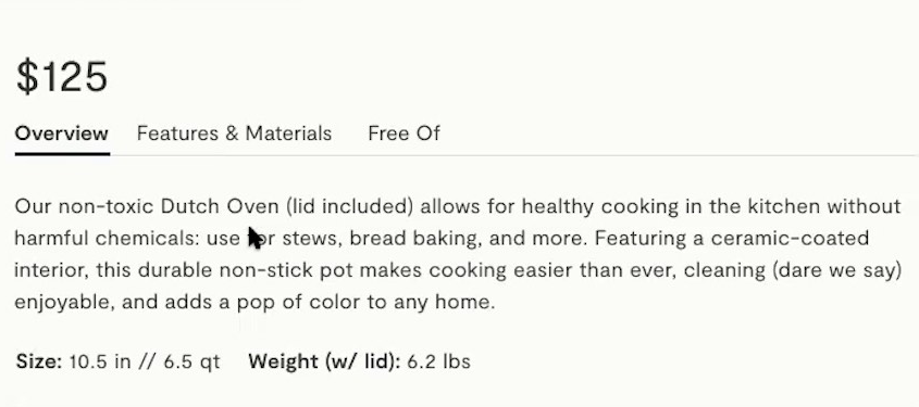
The stands out
The is larger than the below it. That difference helps it stand out.
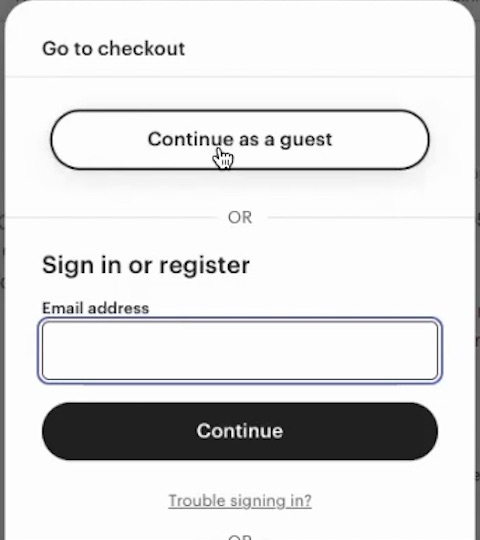
Which page makes easier to find?
The hides the choice
The can sound like you need to create an , even though the text below says you can buy without one.
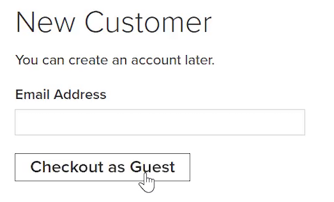
The Continue as a Guest button is placed first
Continue as a guest clearly says you can continue with your purchase without creating an .
 An AI-driven