Grid
A set of lines or areas that helps you arrange a page.
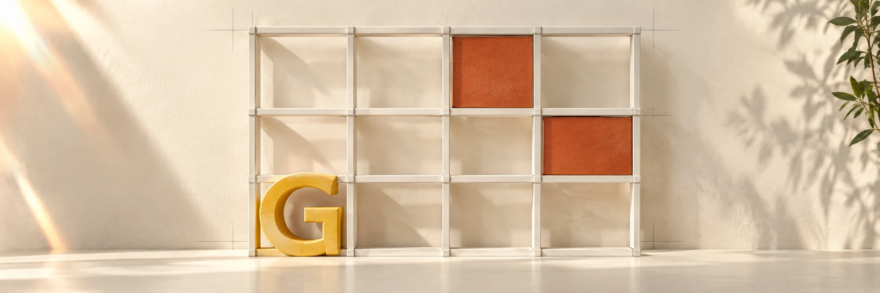
Each red block stands for a content area, such as a photo or text. Compare the big and small blocks. A different arrangement changes what you notice first.
Slide 5.
 An AI-driven
Use guides and space around the edges to arrange a clear page.
A set of lines or areas that helps you arrange a page.
Each red block stands for a content area, such as a photo or text. Compare the big and small blocks. A different arrangement changes what you notice first.
Slide 5.
A line in your design tool that helps you line items up.
The space between important content and the page edge.
To stretch across more than one column or block.
Use these prompts as you work through this lesson.
For exampleLabel blocks “photo,” “headline,” and “details” before styling them.
For exampleUse the same words and image in both grid sketches.
For exampleTry the selected grid across all panels of the brochure.